Here's another before shot:
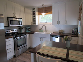
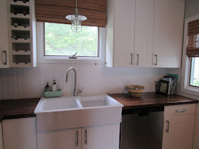
And the after:
The total cost for labor and materials was around $11,000. The cabinets, counters, appliances, sink, faucet, island, and bar stools are from Ikea. I waited for one of their twice a year kitchen sales, so it was all 20% off. Huge savings! The counters are birch butcher block. I finished them myself after they were installed. I'll post that tutorial soon. I had the grimy tile backsplash replaced with beadboard panels. So perfect for a beach house and so easy to keep clean! The flooring is Reclaimed Chestnut laminate by Bruce Flooring. The walls are painted Gray Owl by Benjamin Moore. The trim is Super White also by BM. The pendant over the sink is from Pottery Barn Kids. The ceiling fan, which reminds me of a boat propeller, is from Home Depot. The roman shades are from Overstock.com. The yellow ware bowls are vintage and I've had them forever. The green vase with the cooking utensils and the green container by the sink are from the Brimfield flea market.The locker basket holding my cookbooks is from Old Lucketts Store in Leesburg, VA. The stand mixer is Kitchen Aid purchased on Amazon. The beach glass vase on the island is a DIY project. You can find the tutorial here.
There was almost no structural work done because I kept the original layout. This helped keep the costs down, too. The only change that was made was to replace the window to the right of the dishwasher with a smaller one so that the cabinets could extend all the way to the wall (they originally ended about a foot away). The window over the sink looks bigger, but it's not. I just hung the shade up near the ceiling to disguise the fact that the window is only about 15" high. I used 40" tall wall cabinets to bring them up to the ceiling, eliminating the soffit and giving me lots more storage space.
I'm so happy with my new kitchen! What a change! Here's one more look of the before & after.


That turned out REALLY lovely!
ReplyDeleteThanks so much, Tarahlynn!
ReplyDelete