Tuesday, May 20, 2014

Beach House Kitchen


On to the next challenge--the kitchen. This is a tough one. The current kitchen is...awful. Dark, old, falling apart. There's really nothing good to say about it.


It actually looks worse in person than it does in these photos. When I first saw it, I thought I would paint the cabinets and try to live with it. However, once I took a close look at the cabinets, I realized it wouldn't be worth it. They're in rough shape and the quality wasn't that great to begin. 

Here's more of what I had in mind:


The plan:
It all has to go--new cabinets, appliances, lighting, back splash.
Keep the same basic layout to save on costs.
Add an island.
Make it light and bright.
Continue the same laminate from the family room.
Shaker style off white cabinets and updated hardware.
Lots of bead board.
Farmhouse sink.
Butcher block counters.


Kitchen cabinets, cabinet hardware, sink, island, bar stools: Ikea
Pendant: Pottery Barn Kids
Wall paint: BM Sea Foam
Floor: Bruce Reclaimed Chestnut Laminate

© Salt Marsh Cottage 2014

Sunday, May 18, 2014

West Elm Inspired Beach Glass Hurricanes


In the midst of starting the renovations on the beach house, I took a little detour. I've always been crazy about West Elm's Waterscape line of vases, hurricanes, and votives.


Then I ran across this tutorial from Sand & Sisal and had to try it out. I picked up three medium size hurricanes at the Dollar Store and found a vase at Habit ReStore (also $1). 


Following the tutorial, I picked up three colors of Martha Stewart glass paints in Frost Translucent finish. The colors I went with were Oasis (turquoise), Calico Blue (soft blue), and Beach Glass (light bluish green).

First, I washed everything to make sure there was no grease or dirt on the surface. I used the paint straight from the container without diluting it. Using a small brush, I applied the first coat vertically to the outside of the hurricane and let it dry. I found that it's best to apply a thin coat and not to rework it. Just do it once and don't obsess over "fixing it". I can tell you from experience that it doesn't work.

After the first coat was dry, I applied the second coat horizontally. At this point, I was pretty convinced the project would be a bust, but once everything was dry, it looked great.

Check out the results:


I think they look really cute and for a $1 each plus paint, I can have as many as I want. So check out Sand & Sisal for the tutorial.


© Salt Marsh Cottage 2014

Friday, May 16, 2014

Beach House Family Room


So today I'm starting a series of posts outlining the plans I have for each room. We're starting with the family room, which is the largest room in the house. Here's the before:


This room has a lot of potential. It's spacious and sunny. That whole long wall is pretty much all windows. It's got a great wood burning fireplace with an amazing mantle and surround.

We also have some challenges. The rug? Disgusting. Stained, faded, generally gross. Yes, those are pinch pleated drapes on traverse rods. The room has to accommodate both a seating area/TV watching spot and an eating area (just out of camera where that lovely area rug is). The tile surrounding the fireplace and on the hearth is bad. Real bad. 

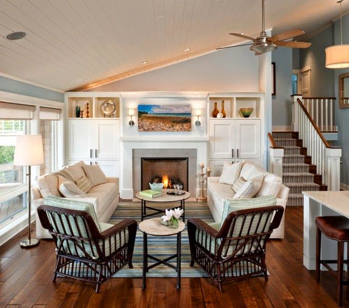
So let's move on to some inspiration. 


The plan:
Grayed neutrals, mix of textures, accents of blue.
Replace the carpet with a rustic laminate.
Update the fireplace with paint, new tile surround, and new hearth.
Replace the dated light fixtures and ceiling fans.
Ditch the drapes.
Paint the trim white and the walls a light neutral gray.
Emphasize the scale of the room with oversize artwork.


Wicker chair—Ikea
Canvas print—Home Goods
Tripod Floor Lamp—World Market
Shade—Home Goods
Pillow—Pottery Barn
Wall color—Benjamin Moore “Horizon”
Flooring—Bruce Reclaimed Chestnut Laminate
Sconce—Pottery Barn
Sectional—Ikea


© Salt Marsh Cottage 2014

Let the Reno Begin!

Well, the beach house reno has begun! Yikes! It all sounded like such a good idea and then when I finally got there and took a good look around...yeah. Pretty overwhelming. Deep breaths.

So I'll be showing you the "befores" of each room and my plans and progress as I move forward, but I thought I'd start off with an overview of the house and what the whole project looks like.

So here it is:

The house was built (and last updated...) in 1980. Yes, all the original wall-to-wall carpet (including in a bathroom!!), appliances, light fixtures, etc. It is about 1600 square feet with 3 bedrooms and two bathrooms. There are 3 decks, a screen porch, a one-car garage, and a full unfinished basement. 

The house has a great layout. You enter through a mudroom and then into the kitchen. The front half of the first floor is a family room with a vaulted ceiling and a wood-burning fireplace. Down a hallway from the kitchen is a full bath and a large bedroom. The second floor has two more bedrooms and a full bath. Structurally, the house is in great shape, but boy does it need updating!

So here are a few highlights of what I'm dealing with.


Wall sconces--note the little crown on top!

Oh joy! Every single switch plate and outlet cover
looks like this!


It's hard to see, but the little ruffled valance
and the shade have matching decorations.

Another awesome light fixture!
And how about that wallpaper?

This is my favorite. No, there's not a problem with your screen.
You are looking at chocolate brown tub with bright gold fittings.

Don't you feel better about your house now? :-)