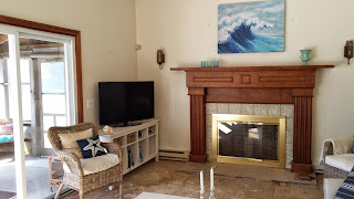
I really wanted the fireplace to be the focal point of the room. It's quite large--5' high and 8' wide, so it fills that whole end of the room. It's the first thing you see when you walk in. The mantel itself was really quite nice. It's oak with some great detail, but the rest of it was pretty awful.
Here's what it looks like now:
Nice improvement, huh?
The first step was to ditch the glass doors. Doing that really opened the fireplace up and improved the proportions. With the doors the fireplace itself looked too small in relation to the mantle. I found a nice simple fireplace screen at my favorite consignment store for $20 and found a set of tools on Craigslist for $15.
Next, we had to deal with that awful tile!! When I saw this tile at Home Depot, I knew it was exactly what I wanted. The colors remind me of sea shells and beach pebbles. At $13 a square foot, it was a little more than I wanted to spend, but it was too perfect to pass up.
Then I found the hearth tile on sale for around $1.30 a square foot. It's similar to this tile.
After the tile was installed, we decided to get a set of propane logs. Can I tell you how much I love starting a fire by simply pushing the button on the remote? Plus it really does a great job of heating the room in winter. With 16' ceilings, keeping this area warm is not easy. Now we can sit and watch TV in comfort.
I originally wanted to paint the mantel and surround white to match the trim. My husband (who usually just goes along with my design choices) had a fit. To keep the peace, I agreed to keep the wood as is. And you know what? He was 100% right. I am so glad I didn't paint it. The contrast of the warm wood tones is just what the room needed.
We updated the sconces on either side of the fireplace. The originals looked like something from a medieval castle.
We replaced them with these Pottery Barn Napa Wine Barrel Sconces. Apparently they've been discontinued, but you may be able to find some on ebay or at a PB outlet store.
I found the mantel challenging to decorate because of the scale. Little stuff gets lost and looks silly. I finally came up with something that works. For the left side I found this wire candle holder at Home Goods. The whale, made from upcycled oil barrels came from a local store.
On the rights side, I used a large vase from Home Goods filled with beach stones and dried grasses from Ikea. I added a fishing creel that I got years ago at Brimfield and a beautiful shell given to me by a friend.
I've tried a number of different prints for this spot. Again, scale was an issue, but so was color. I now have this print from Pottery Barn in the 28" x 42" size, with a distressed black frame and no mat. I think the colors work really well in this room with the sandy neutral tones and the graphic navy stripes.
And there you have it! My completed fireplace makeover!


No comments:
Post a Comment